


Savings/Checking
CD Rates
Banking Reviews
Tools & Apps
Banking

The Highest Interest Rates for April 2024
The Federal Reserve last raised interest rates by 0.25% on July 26, 2023. The hike is an effort to help bring inflation down. While higher interest rates are not great…

Best IRA CD Rates for April 2024
I recently learned that my father has decided to cash out his UPS pension. The immediate question from my dad was, “How do I avoid paying taxes on this thing?”…

23 Best Bank Bonuses and Promotions of April 2024
If you are in the market for a new savings or checking account, signing up for one with a bonus promotion is a great way to earn a little extra…

The 10 Best Online Banks – April 2024
With more online banks available now than ever before, finding the best online bank has never been easier. In this article, we’ll explain how online banks work, whether or not…

Best Student Checking Accounts and Banking Options
If you held a part-time job in high school, you may have a bank account or even a credit card in your name. But if you didn’t work — maybe…
Best Bonuses for Business Checking Accounts in 2024
Business owners know that every dollar counts. Now that you have some cash flow, your deposits and expenses mustn’t get mixed up with your personal expenditures. A separate business checking…
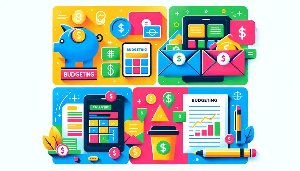
Apps & Tools
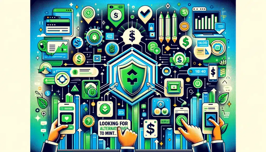
The 10 Best Mint Alternatives for 2024
Mint.com has been a good budgeting tool. I have used it myself from time to time. Unfortunately, however, Mint.com has closed for good, and the transition for users to CreditKarma…

7 Best Money-Saving Apps for College Students in 2024
Living on a shoestring budget is a common challenge for college students. But you can help your financial situation by choosing one of the best money-saving apps for college students…
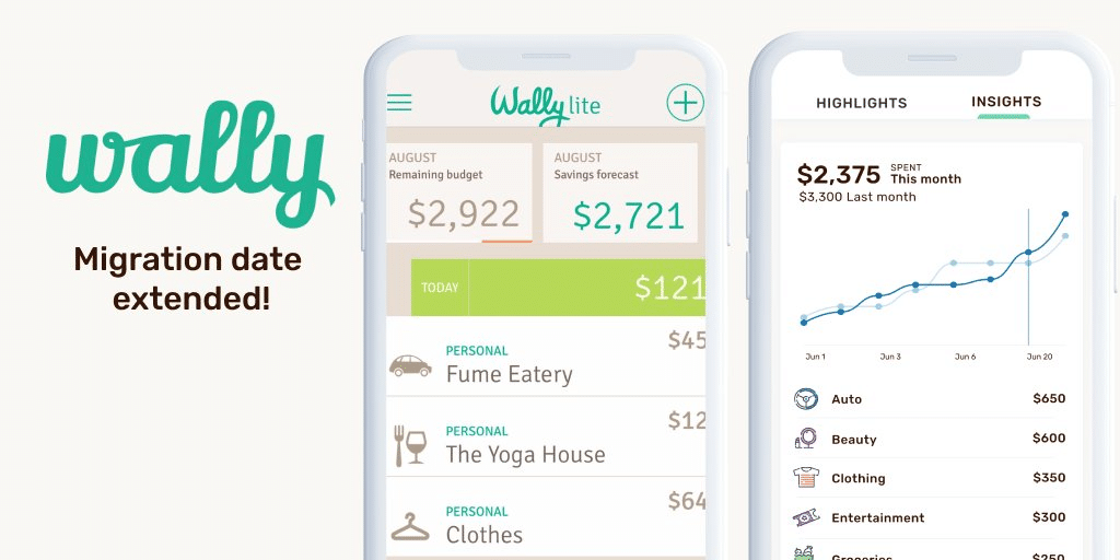
Wally App Review 2024 – Creating a Budget with AI
Wally GPT bills itself as “The World’s 1st AI-Powered Personal Finance App.” Is Wally simply cashing in on AI mania? Does AI even make for a better personal finance app?…
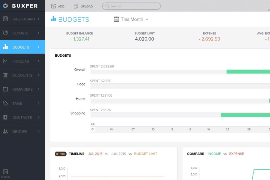
Buxfer Review 2024 – The Most Comprehensive Budgeting App
Buxfer is a budgeting app that claims to help you take control of your financial future. Is that true, or is it just a marketing spin? You can answer that…
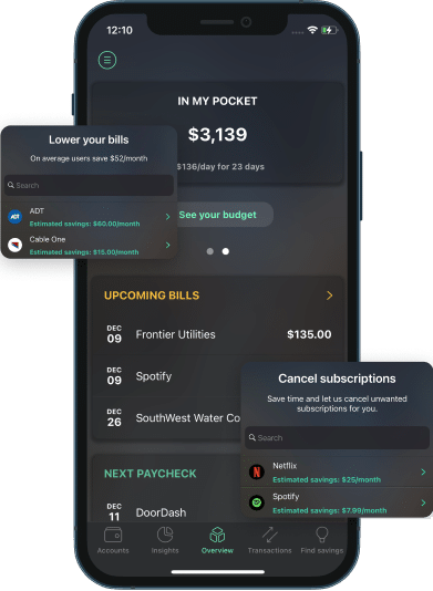
PocketGuard App Review 2024 – Know What’s in Your Pocket at All Times
There are plenty of budgeting services and apps to choose from. One well worth considering is PocketGuard. It’s an app that tracks your spending, helps you budget for expenses, and…

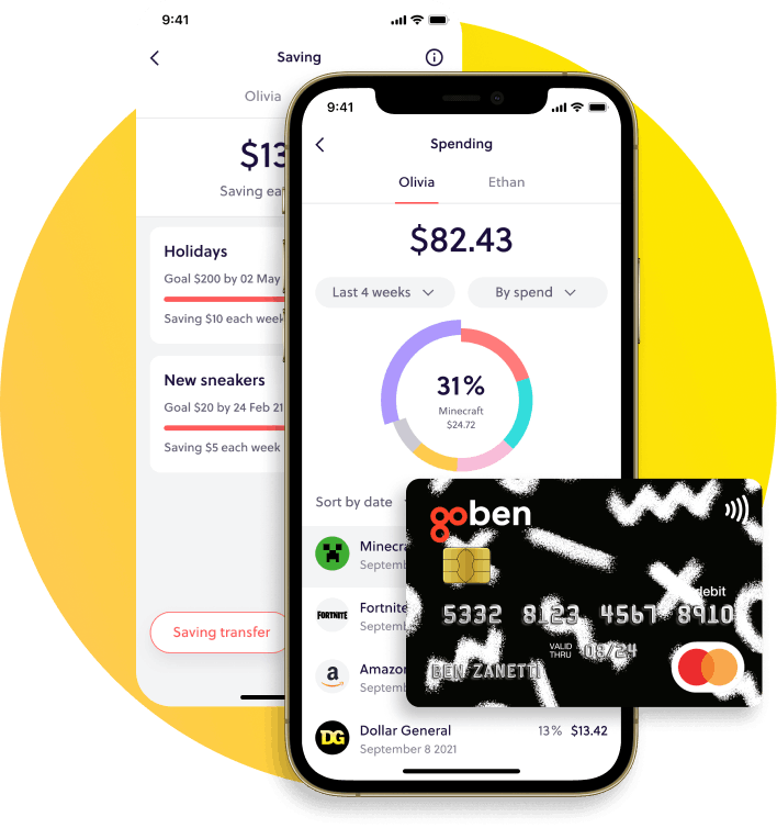
The Best Money Apps for Kids and Teens in 2024
I grew up learning many financial lessons from my parents. Unfortunately, most of these were learned by watching my parents make bad decisions that I was determined not to repeat…
Latest Articles

How to Use Google Calendar to Track Your Cash Flow in 7 Easy Steps
My husband and I have used many budgeting tools, including Rocket Money and YNAB. We still use (and love!) YNAB, but it left us with a gap: cash flow planning…
The Highest Interest Rates for April 2024
The Federal Reserve last raised interest rates by 0.25% on July 26, 2023. The hike is an effort to help bring inflation down. While higher interest rates are not great…
Best IRA CD Rates for April 2024
I recently learned that my father has decided to cash out his UPS pension. The immediate question from my dad was, “How do I avoid paying taxes on this thing?”…
23 Best Bank Bonuses and Promotions of April 2024
If you are in the market for a new savings or checking account, signing up for one with a bonus promotion is a great way to earn a little extra…
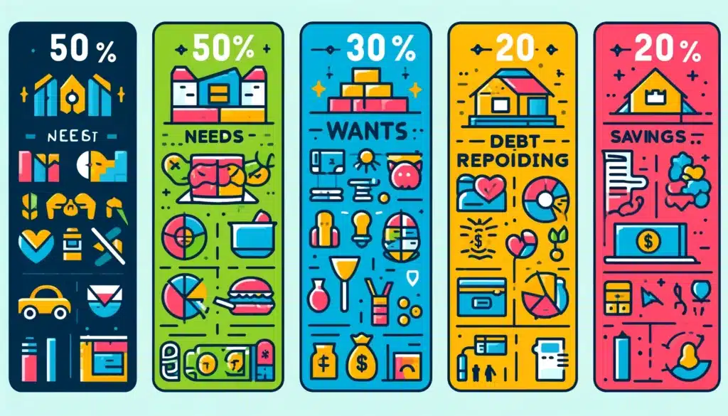
Is the 50/30/20 Budget a Good Rule of Thumb?
For many, budgeting is about as appealing as a root canal. Yet, failing to budget can result in overspending. One budget that enables you to control spending without feeling you…
The 10 Best Mint Alternatives for 2024
Mint.com has been a good budgeting tool. I have used it myself from time to time. Unfortunately, however, Mint.com has closed for good, and the transition for users to CreditKarma…